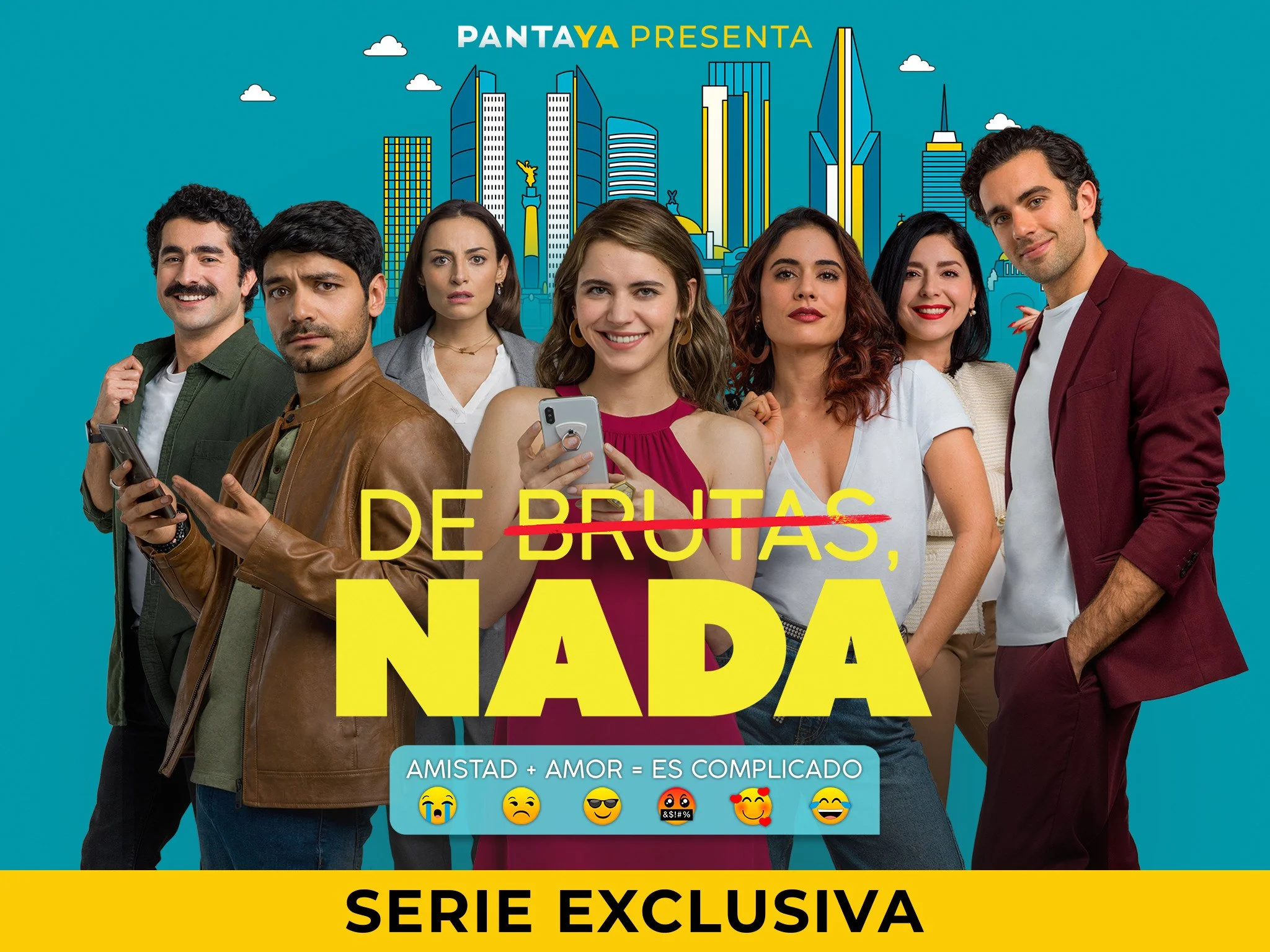
De Brutas, Nada
Seasons 1 & 2
Client: Sony Pictures Television & Amazon Prime Video
A betrayed fiancée looks for a roommate to help her pay the rent and welcomes a guy only because she thinks he’s gay. By the time she finds out the truth, they’re already in love with each other.
Key Art Creative Concept
Art & Creative Direction
Title Treatment
Graphic Design
Print & Social Media Campaign
Title Treatment
“Not Dumb At All”
For De Brutas, Nada, the logo was designed to immediately reflect the show’s playful, modern tone and sharp sense of humor. We chose a clean, sans serif typeface to keep it lighthearted, fresh, and contemporary—mirroring the energy and relatability of the series. Given the literal meaning of the title (“not dumb at all”), we placed visual emphasis on “Nada”, setting it in bold, while “De Brutas” appears lighter, creating a clear and witty hierarchy.
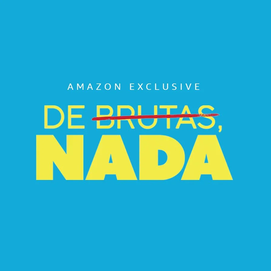
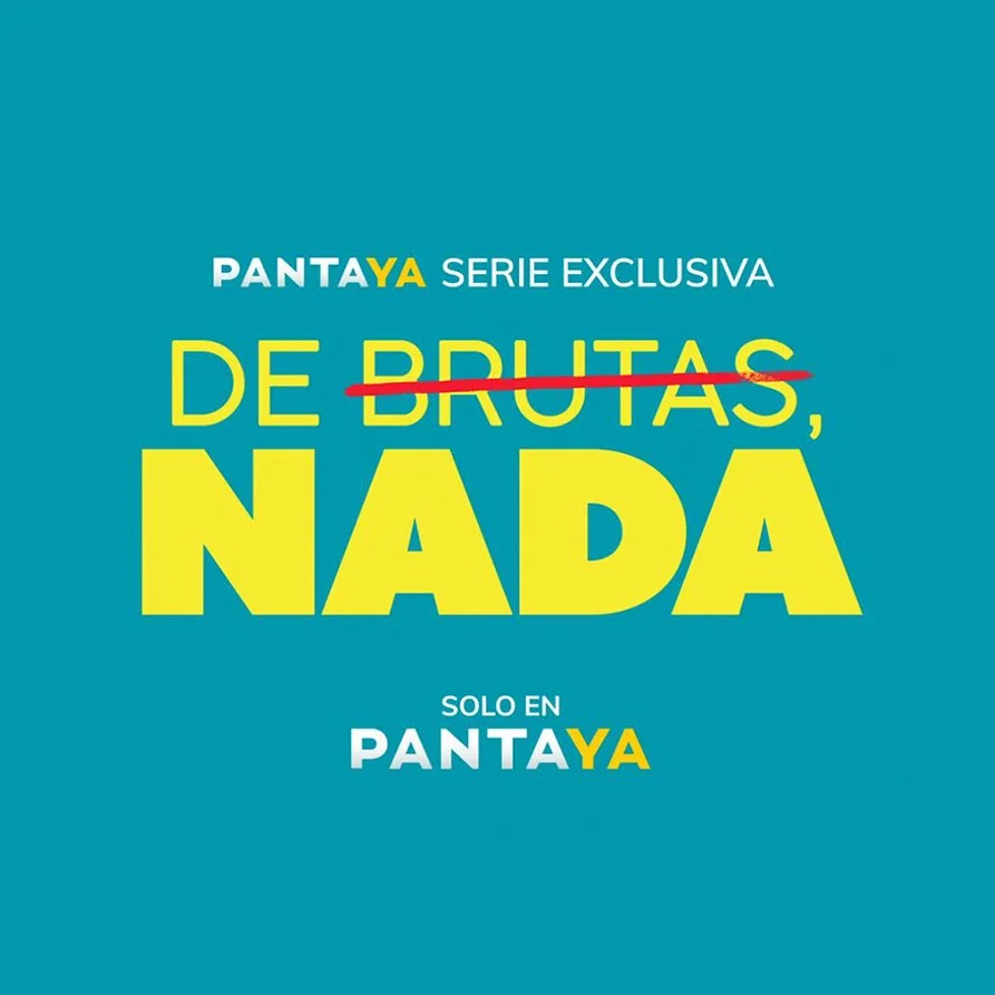
A crossed-off graphic element reinforces the idea of challenging assumptions, aligning with the show’s comedic twist.
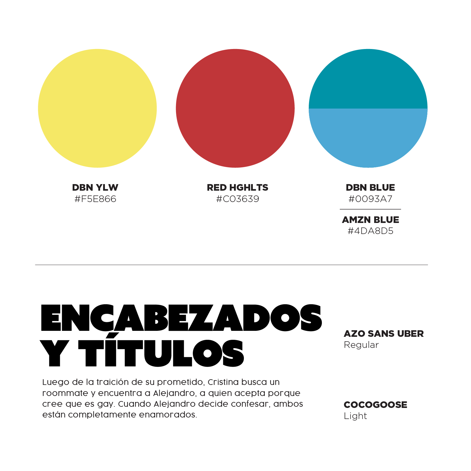
The color palette: yellow type with a red strike-through to add boldness and humor.
We adapted the design to work with two blues: Amazon Prime’s blue for the initial streaming launch, and the series’ own blue for the networks that aired it afterward.
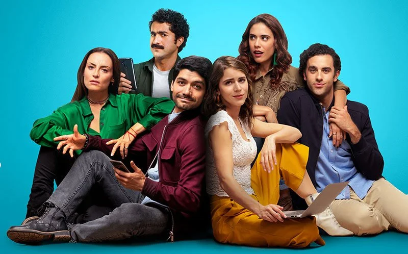
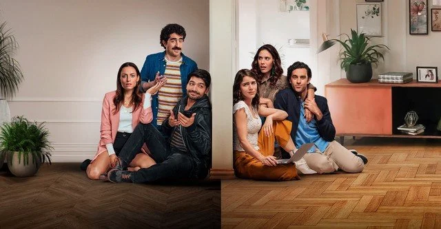
S1 - Key Art
Love Is Complicated
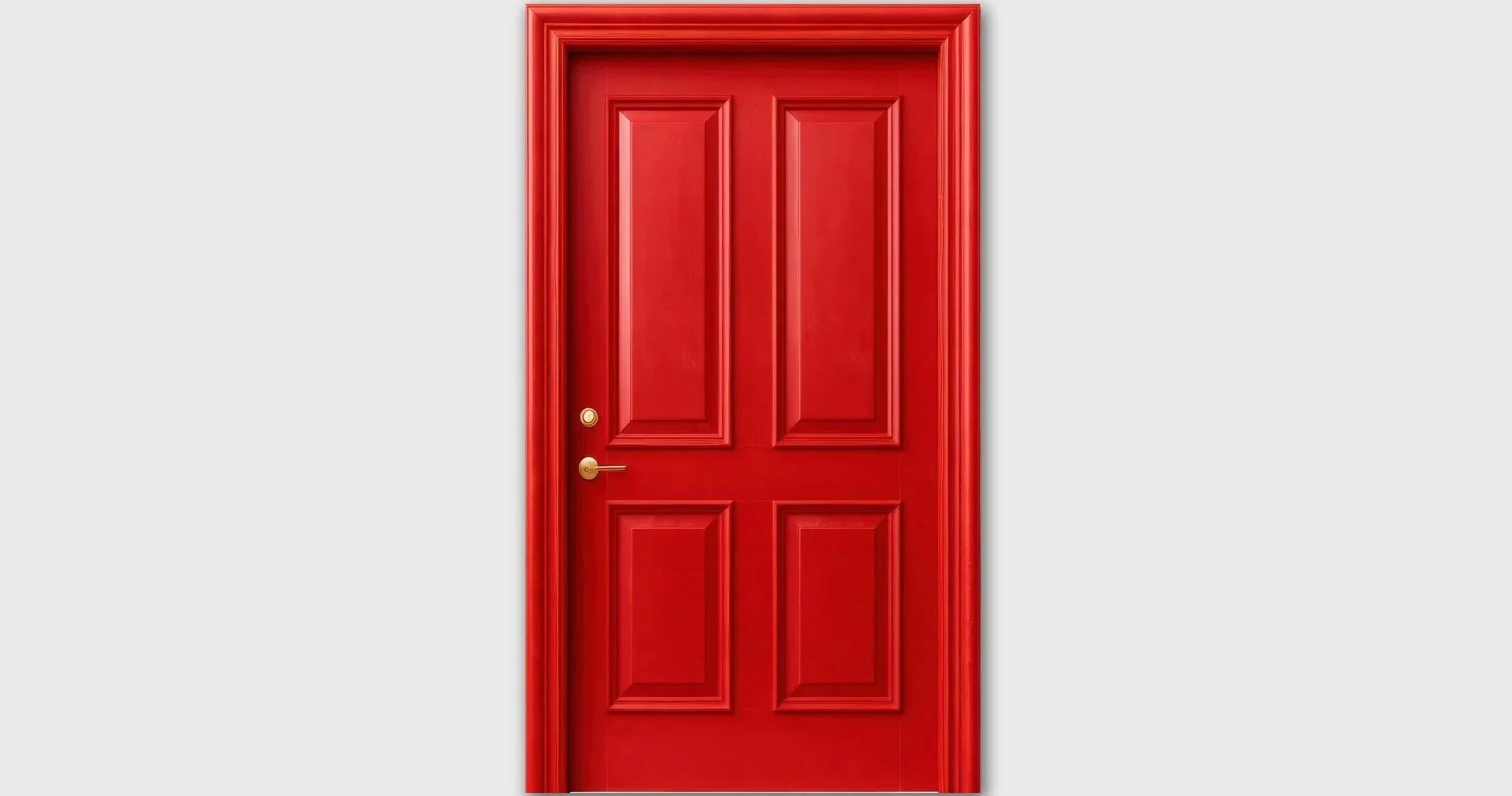
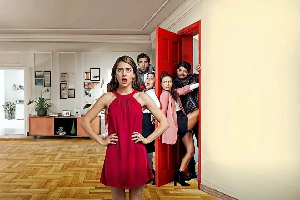
For Season 1 key art, we used a bold red door as the central metaphor to symbolize who you let into your home and your life. Cristina is front and center as the emotional anchor, while the conflict unfolds around her: her group of friends inside the apartment pushing the door shut, and her new roommate’s friends outside, trying to force their way in. Each character’s facial expression was carefully directed to reflect their personality and the tension of the moment, reinforcing the humor and chaos at the heart of the story.


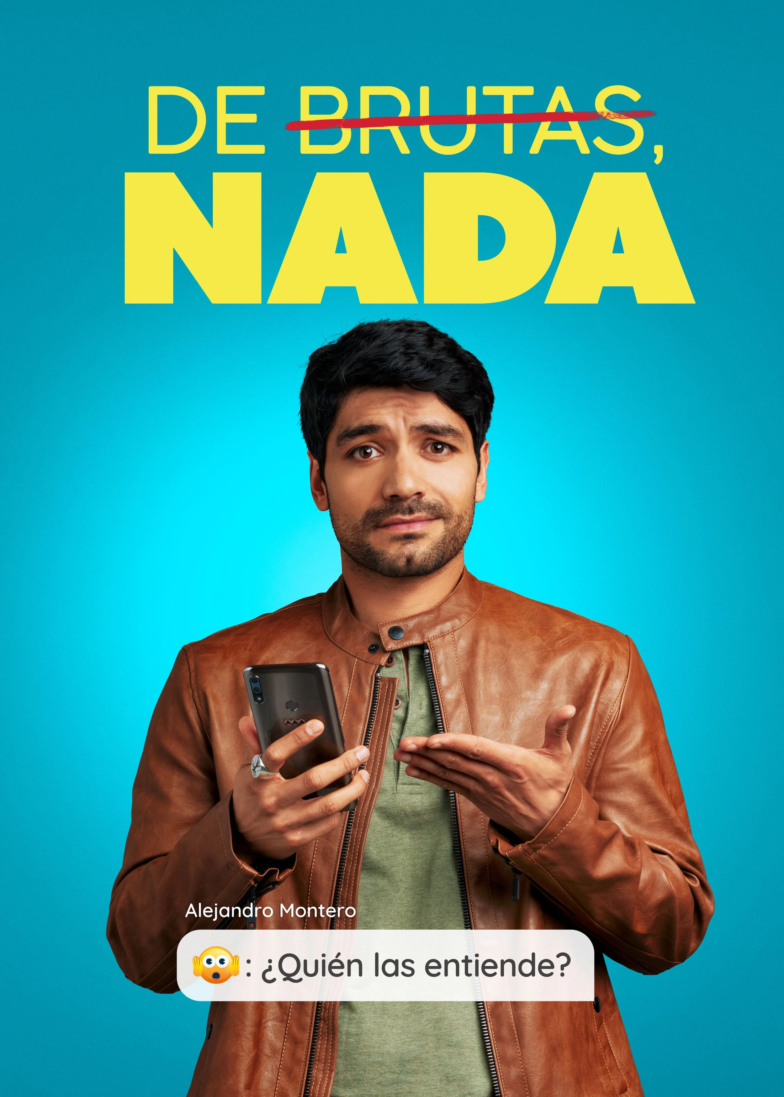
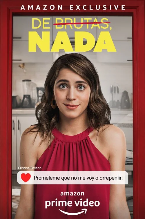
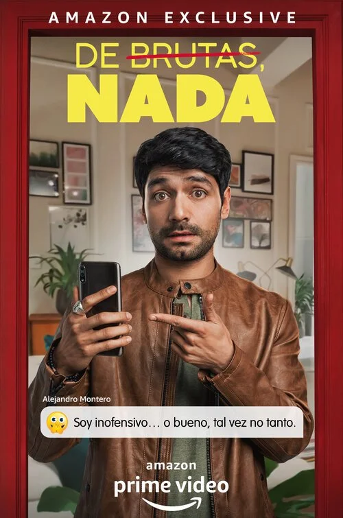
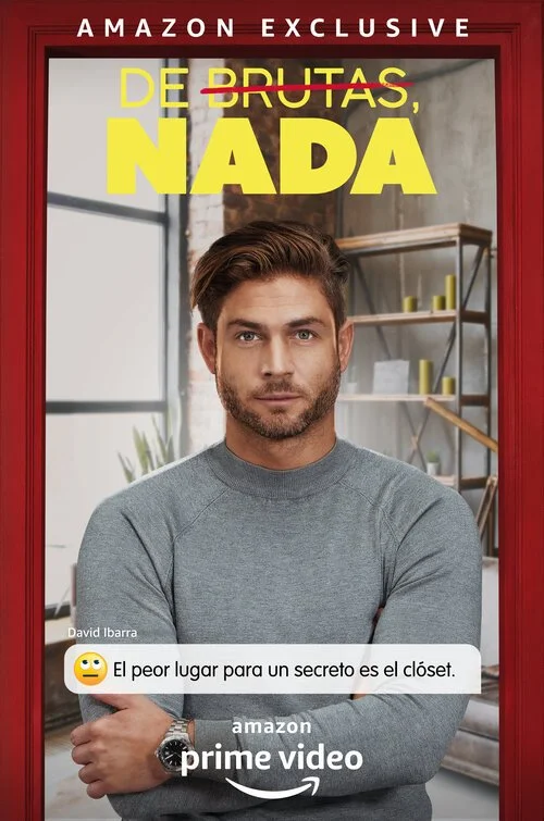
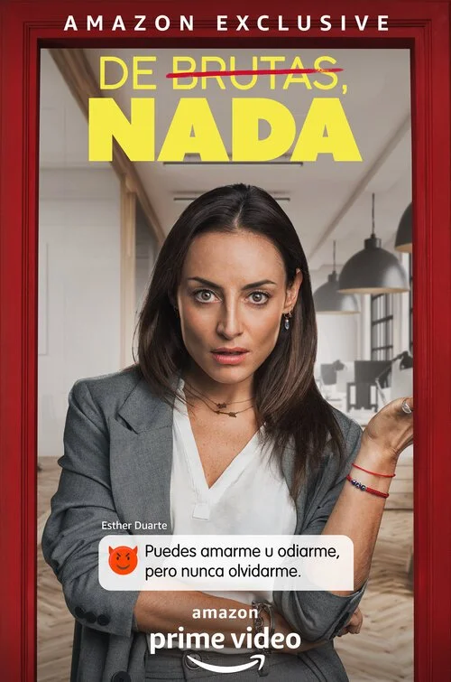
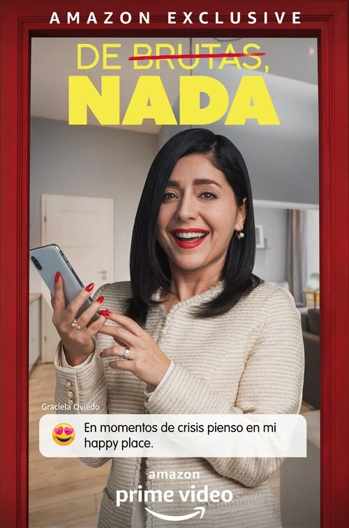
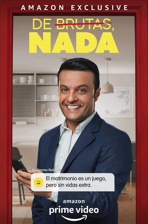
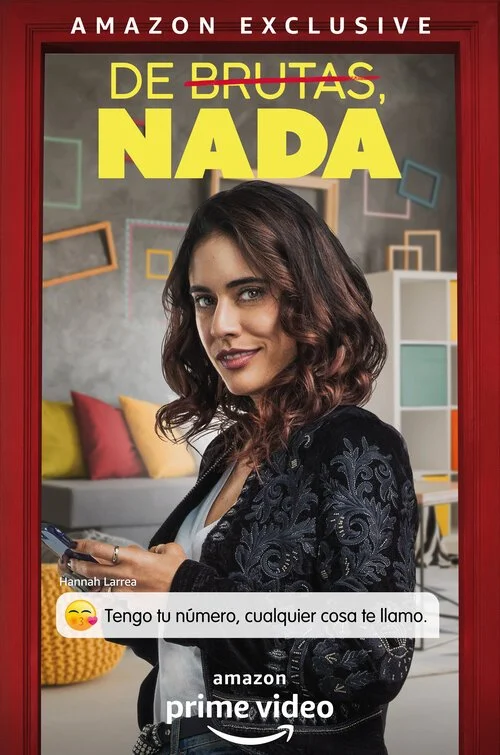
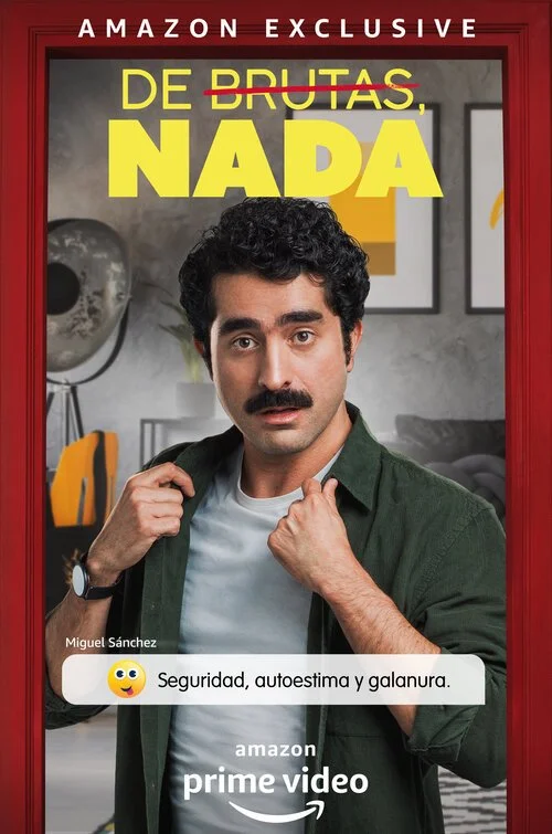
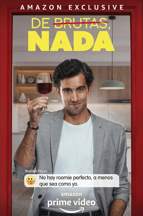
S1 - Individual Key Arts
We conceptualized visuals for the 10 main characters, each framed within the red doorway to maintain a strong connection to the main key art and “roomie” theme.
Every character was placed in a distinct interior setting that reflected their home style, with directed poses and expressions to amplify their personality trait.
To add a playful, modern layer, each piece included a custom tagline written as a text-message–style bubble or status graphic, complete with emojis, reinforcing character voice and humor.
TV, Print & Social
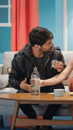
Living With “Roomies”
The TV, print, and social campaign focused on the universal (and highly relatable) experience of living with roommates. We highlighted the relationship dynamics between characters to create humorous, human moments that felt instantly familiar. For social, we leaned into fun, trend-driven content and scripted scenarios inspired by real roommate situations, using the show’s tone and red door theme to drive engagement while also promoting Amazon in an organic, entertaining way.
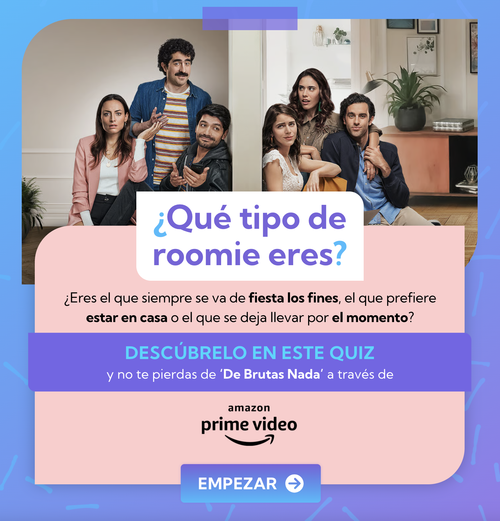
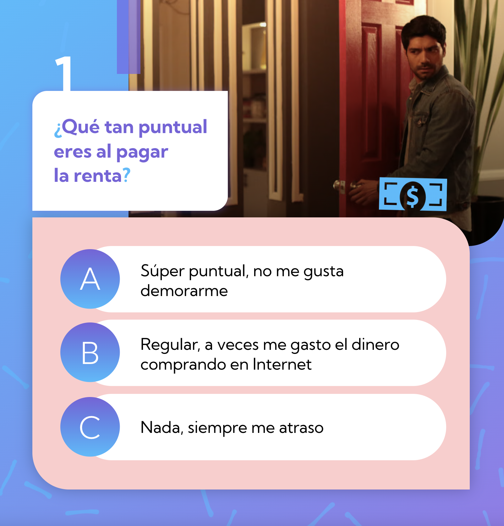
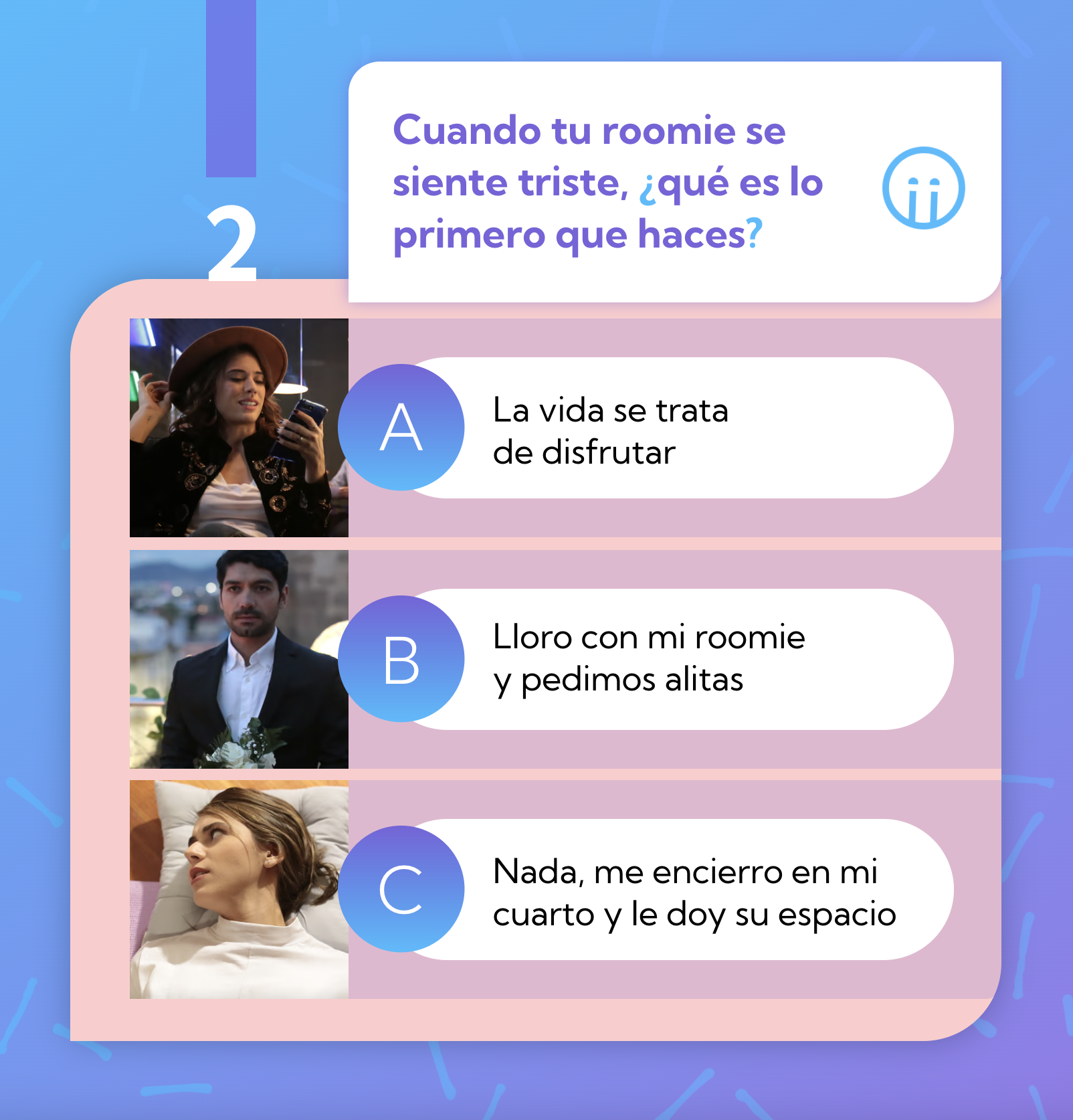
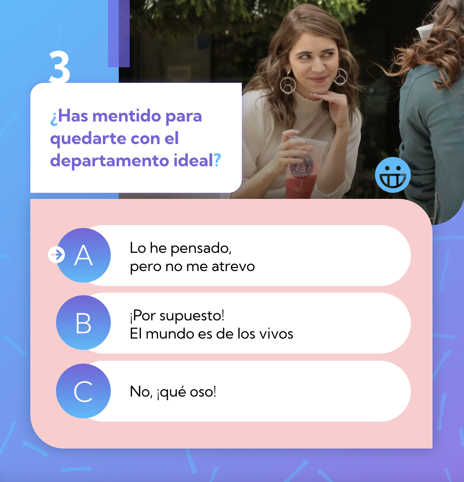
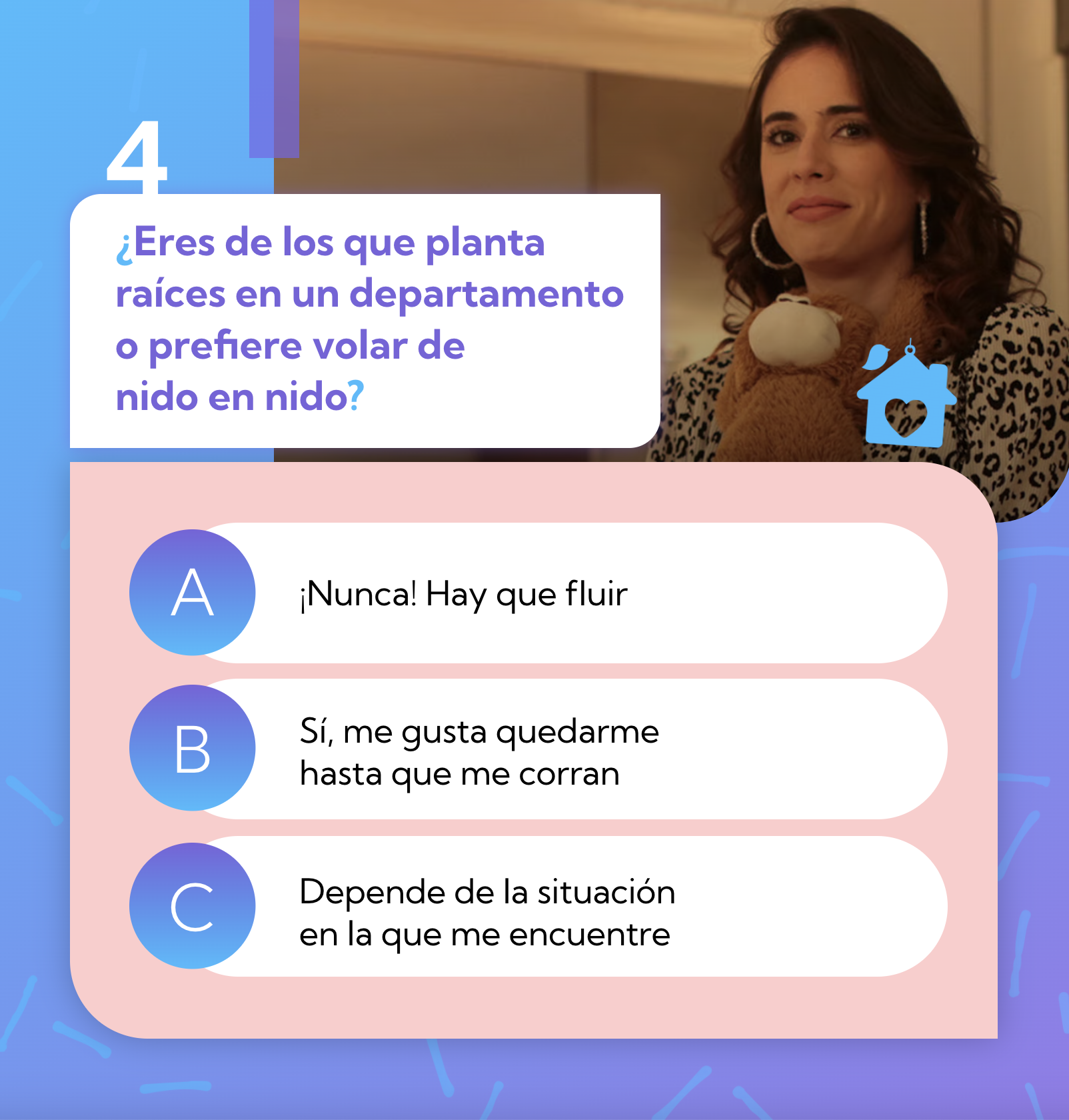
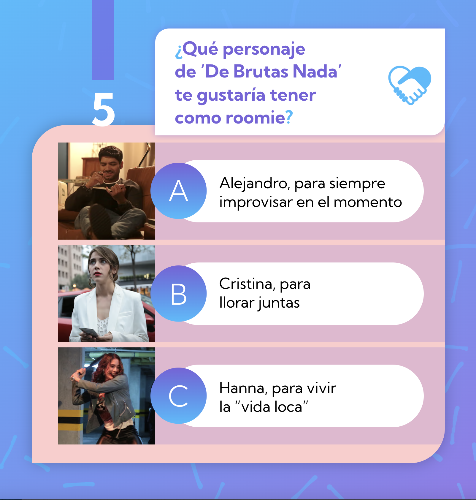
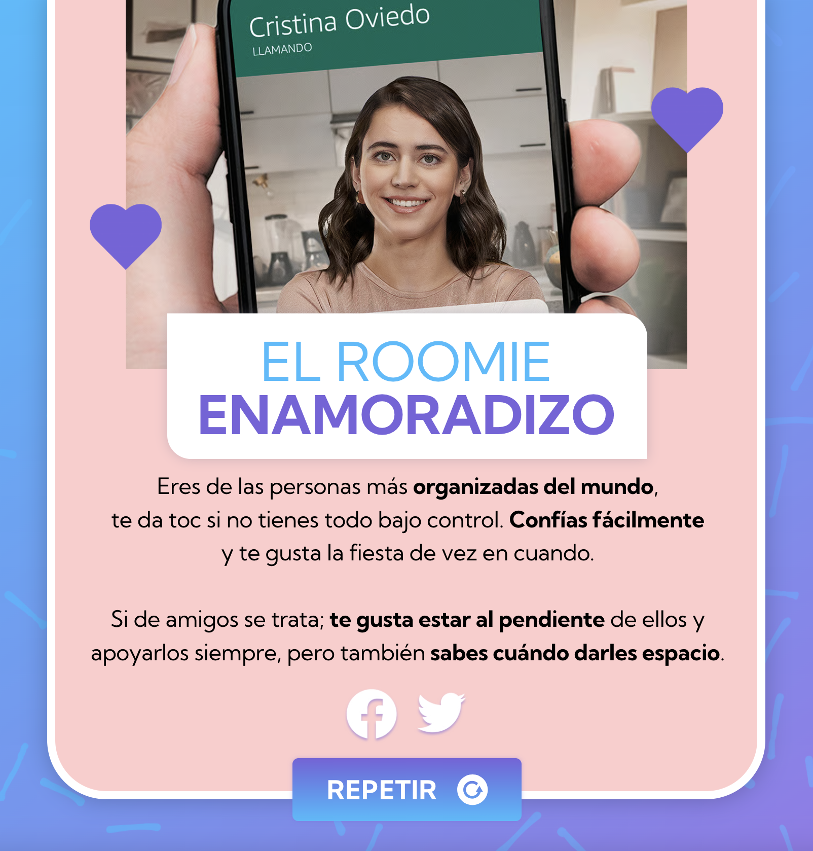
Roomie Quiz
Created an interactive online quiz designed to drive users to the Amazon platform, where fans could discover what type of roommate they are, and which character they’d be most compatible living with, while encouraging them to watch the series.
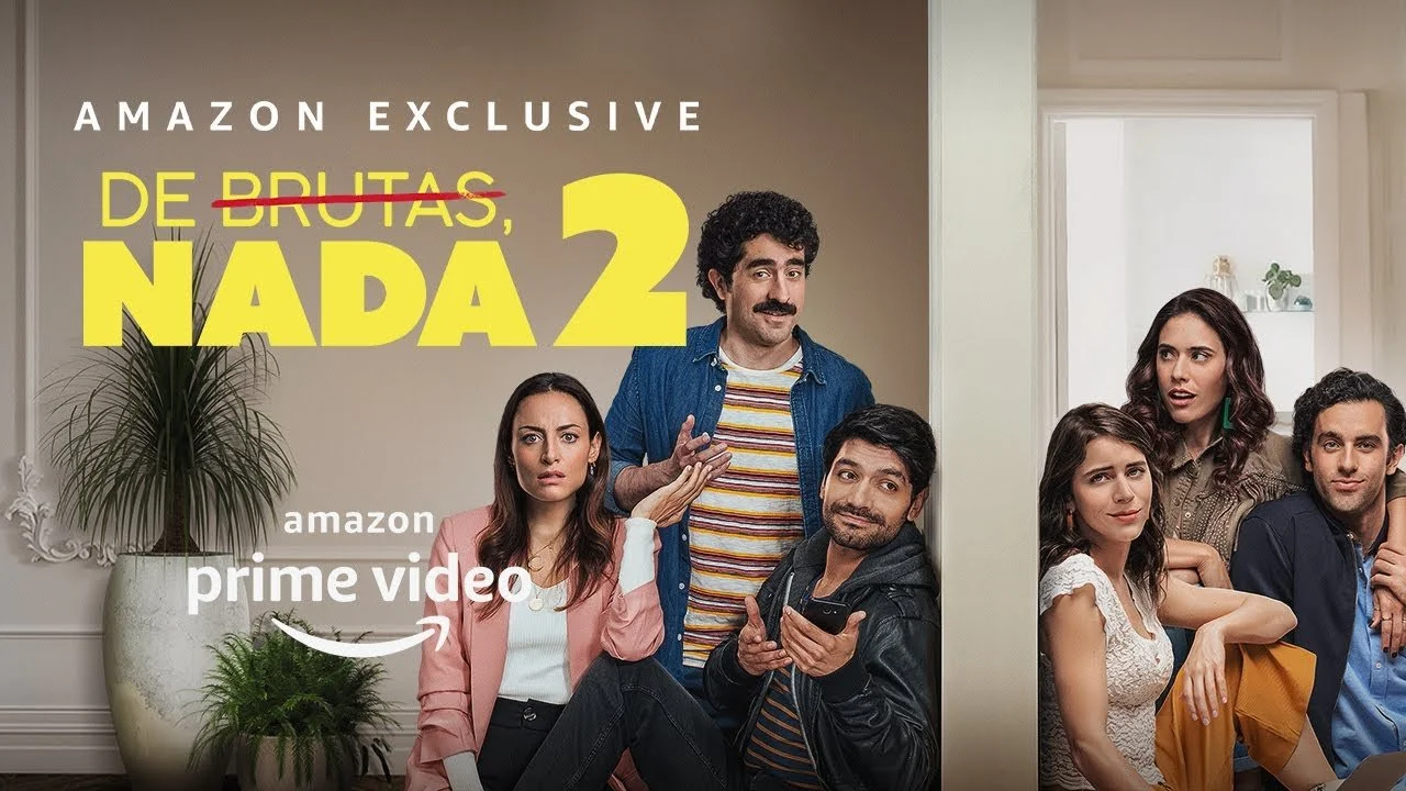
S2 - Key Art
Love, Divided
For Season 2, the key art concept centered on “Love, Divided.” As Cristina falls for her “gay” roommate and then discovers the truth, both the house and relationships fracture. So we used a physical wall to split the characters, visually capturing the comedic tension and divided loyalties on both sides.
TV, Print & Digital
Promoting New Season
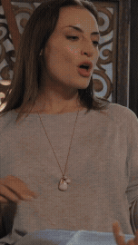
Extended the “Love, Divided” theme through short skits between characters, using sarcasm, witty humor, and highly relatable scenarios to highlight the fractured relationships and evolving dynamics while keeping the tone playful and comedic.
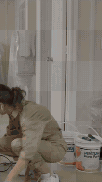
Roomie Nightmares
Crafted a campaign inspired by “Tinder Nightmares” that unveiled the hard, complicated, and hilariously unspoken truths of living with roommates. We invited viewers and followers to share their own “roomie confessions”, turning real-life experiences into a bold and relatable social conversation.


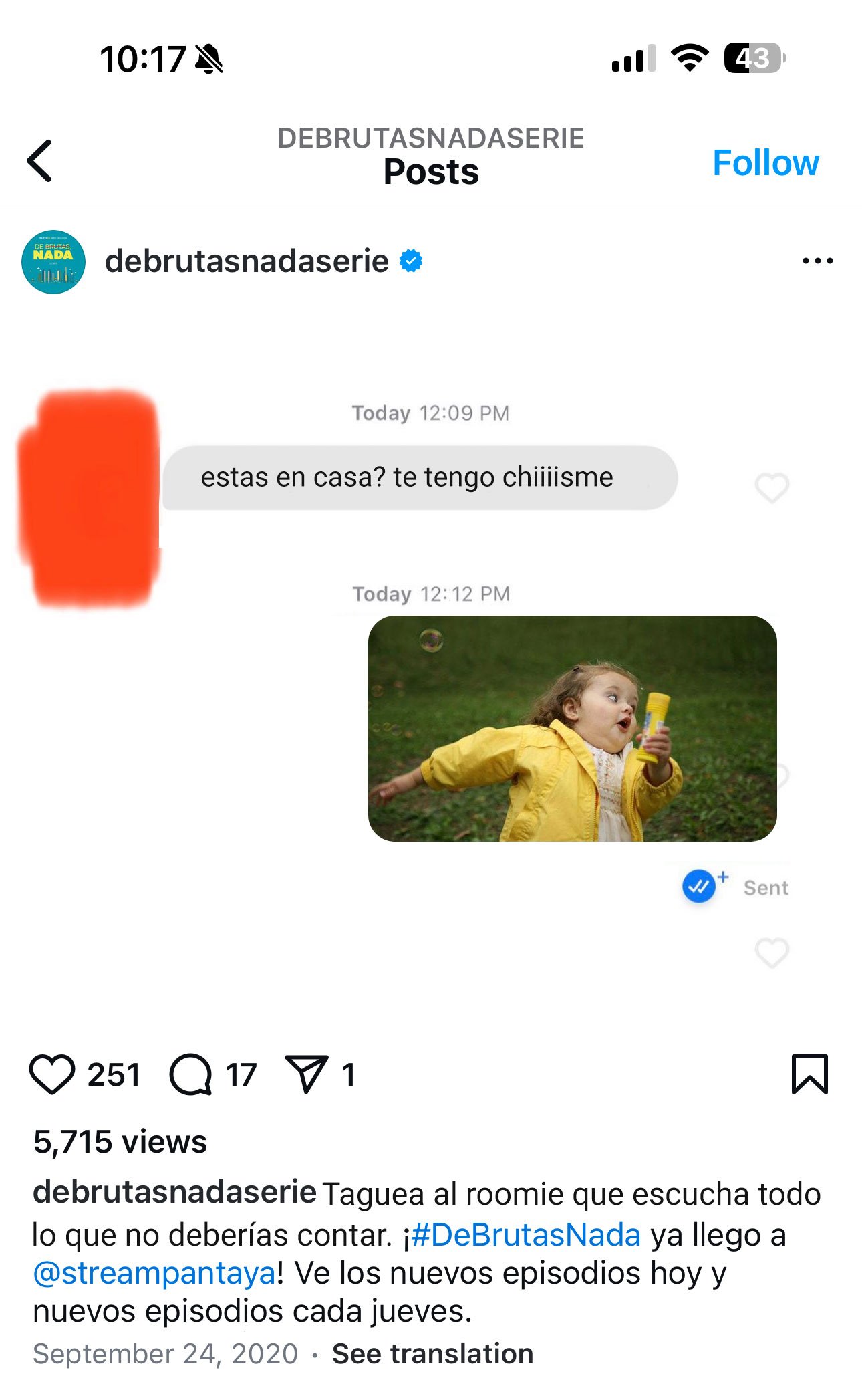
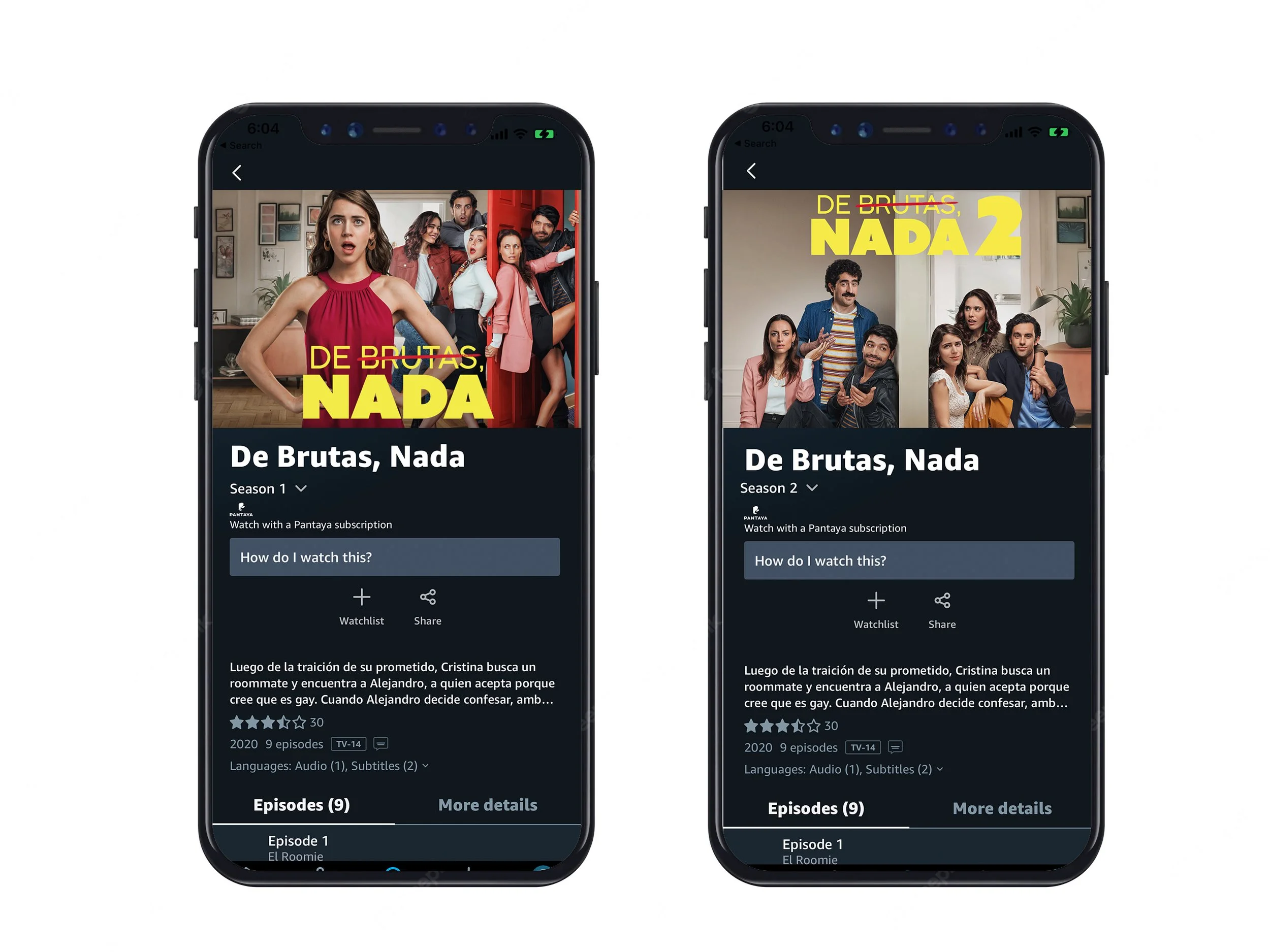
Photo Bank
During production, we captured extensive photography of the cast to build a robust photo bank, allowing us to efficiently create new key art and marketing assets for additional networks airing the series after Amazon Prime.